English translation of a Persian article from the WebTarget archive. The date above is the original publication date. Some advice, especially technical details, may be outdated.
Grids and alignment in web design
Balance
Balance is one of the fundamental principles of design. It describes the distribution of visually heavy and light elements across a page. Larger, darker elements tend to feel heavier, while smaller, lighter elements tend to feel lighter. Understanding that distribution helps us create a balanced composition.
One of the simplest ways to create balance is to use a grid. A grid gives the elements in a design a consistent system of alignment and proportion.
Visitors can sense these lines and follow them with their eyes, even when no actual grid lines are visible on the page.
Because web pages are made up of rectangular areas, these invisible lines can be especially useful for creating balance. Study the following comparison to see how alignment changes the effect of a layout.

Both examples use the same elements. In the upper example, the eye moves more easily across the arrangement. The viewer can find a pattern and make sense of the relationship between the elements.
In the lower example, the elements seem to be scattered without a clear connection or balance. The eye searches for rhythm, continuity, and a pattern. Providing these cues helps a visitor understand a page more quickly. Irregular arrangements can be useful in art and design, but they should be used carefully when the primary purpose is to organise and communicate information.
A website usually exists to communicate information. That information needs clear organisation and appropriate alignment.
How can we use a grid?
Grids became widely adopted in web design, and different systems emerged to make them easier to use.
A grid helps designers plan a layout while keeping its parts aligned. It provides a shared structure for positioning content, rather than leaving each element’s placement to guesswork.
One system popular when this article was written was the 960-pixel grid. It uses a fixed overall width of 960px. This is a historical example, rather than a required width for modern websites.
12-column, 16-column, and 24-column layouts
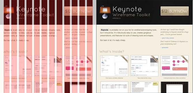
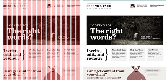
The system can organise the different parts of a website, including the sidebar, header, main content, and footer. A consistent grid also makes it easier to plan margins and padding.
The examples below show layouts built on a grid. Their dimensions and spacing can be calculated systematically, reducing mistakes in alignment.
A well-used grid can make the design process more efficient
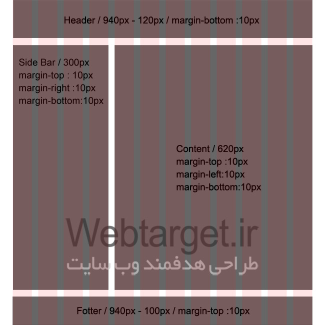

You can download the original grid files for use as guides in Photoshop.
12-column, 16-column, and 24-column templates